Showing posts with label anisha quyum. Show all posts
Showing posts with label anisha quyum. Show all posts
Thursday, 26 January 2012

Tuesday, 24 January 2012
Q2: how effective is the combination of your main product (video)and ancillary texts(digipak and advertisement)
I think overall, our target audience will be pleased with the whole combination. The reason being Is because I feel as if we done a good job in showing the visual links between the music video and ancillary. I believe that the images that I used on my ancillary products are very bold and eye catching. I also believe that it is very controversial as it reflects and pictures the whole theme itself. Our target audience is aimed at the more young teenage based audiences. Reason being is because the music video illustrates heartbreak, loneliness and isolation. These are all qualities that most teenagers go through. So I strongly believe that the ancillary reflects all the qualities which make it very successful in trying to attract our target audience.


The obvious clear link between the advert and Digipac is the picture , i decided to use the same picture as i thought that picture was effective in a sense it reflected the musicvideo it self, it represented heartbreak through the heart placed on her lips.In addition the texts used are the same , i wanted the same text in my ancillary so it keeps constant throughout the process aswell as that i wanted the audience to familiarise with her lego which is represented through her name.
Monday, 23 January 2012
EVALUATION : In What ways does your media product use, develop or challenge forms and conventions of real media products?
Andrew Goodwin explains how the traditional narrative techniques do not apply to pop videos, mainly because pop videos take a different approach, such as a lot of repetition; this is done mainly to help the audience get familiar with the song and its beats. This was one convention that we defiantly approached, however Mulveys theory that in today’s society allot of music videos, women are portrayed as sexual objects. However in our music video we challenged that convention and represented our artist in a more sensible way. Carole vernallis study on the way camera work and editing works, she observed that edits are more frequent in music videos then films, and how the edits in music videos come out much more successfully as it connects closely with the beats of the song which stand out as disjuncture. This is one convention that is represented in our music video we defiantly edited to the beat and this helped keep the music video interesting.
Tuesday, 10 January 2012


Day 3 Of Ancillary Production

Playing about with the filter tool , as-well as the contrast. however realised this looked to cartoonistic. and it didn't go well with the type of look i was going for,

this was was really natural , made the skin look more flawless , but for me it wasn't so eye catching.

This was looked to light .


Finally , decided on this filter

i also added ICONs as well as the date,

MY CD COVER.
Day 2 Of Ancillary Production

using the filter tool , it allowed me to create a more effective picture. at first i wasn't so sure on what effect i should apply , however after playing about with the different choices that i had available ,it allowed me to pick a more artistic sort of font. i also played about with the contrast and intensity tool.
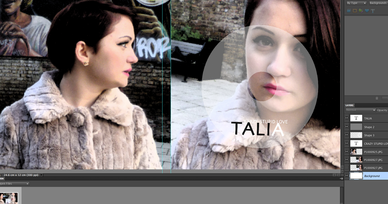
at first , the CD was originally black , but i realised that didn't work so well , so i decided to make the Cd clear, by using the opacity tool.


Thursday, 15 December 2011
Day 1 Of Ancillary Production


This is the image I was going to use, but decided not to, what I did is use the tool to clear out the background. However I noticed that this picture didn’t work so well like the others did. In my mock up this was my original picture as well as muddled up letters beside her , but when I tried that out it didn’t work so well.
For my front panel, I used a filter to edit the picture. I decided that the filter made my picture stand out more and it looked more effective then the original picture. i also then had some trouble with the text , i wasn't sure on which text would look the best ,i was also struggling with the colour at first i choose a light Gray but then my teacher told em that it wasn't noticeable.


Then I went on and started editing my second panel, I also added a filter to this image along with a blur so it allows the track list to stand out more. Then went on adding the record label and bar code.

Other inspirational digi pacs : RESEARCH


I really love how powerful that image is, her picture really stood out to me. I love how the bright red lipstick illustrates her music video. Her theme was about poison I think she really did a good job in relating to that.


Monday, 12 December 2011
Ancillary products: PLANNING

This is the picture that I choose to use as my front panel, the reason why I choose this picture was the following. Firstly it is a very controversial picture really reflecting powerfully with the audience also allowing the audience to see her sort of lonely but crazy side. Secondly because it is not any close up it’s a close up that allows people to see her personality through the way she portrays herself. Lastly because it is an amazing picture I choose this picture from inspiration. When I started researching I decided to get inspiration from Rihanna and Jessie J these two artists have really shown many different sides to themselves and I think that’s something I would like our artist to do also.

I intend to use this picture, as my second panel. My aim is to crop out the background leaving me with just her body. What I love about this picture is that it demonstrates and reflects her lonely side; it sort of allows the audience to get in touch with her emotions.


Not quite sure which picture I may use as my inner panel , but have more chance in sticking with the first image.
Research :Ancillary

This picture really did influence me. I love the way Jessie Js lips stand out, the image I think is very powerful as it reflects her personality I also think that this image can s interpret the type of person she is. I also choose this picture as inspiration as her lips stood out for me I love the way it is unique. Hence the fact I choose this picture as I wanted to go for that funky, crazy controversial look.
Fonts : research
As I was researching some Digi Pacs, I noticed how the font makes a big difference. I think the font should reflect the theme. So I intend to keep it simple, bright and bold. I want to have my artist name in capital letters (TALIA) so it don’t just override the picture its stays simple but elegant. I intend to place her name on the bottom of the Digi Pac. However choosing the font is the difficult part as I have no idea on what to settle for.


I also love the way lily Alan font goes so well with her controversial videos , her fonts are eye catchy exciting and bold.

These are some that I have tried out; I think they are all very similar to each over. So it’s hard to make an easy decision. However I do really like the first one because it has a slight gothic touch to it and I think that goes very well with the personality of our artist , not only it will go very well with my picture also.

What I also researched was other Digi Pacs and how their fonts reflected their music video and their theme. I found allot of inspirational ones for example a Rihanna Digi Pac. i love the way her font is so simple but very eye catching as it dont override the image , this is somthing i am going to adopt. I intend to use a font like this across the bottom in bold.
Pitch for ancillary work
Last lesson I presented my Digi Pac and advert to Annabel , she gave me some advice on what would work better , like for example we discussed my front cover and how it may be best to include her eyes , as I decided to cut her eyes in the picture , so we can just focus on her lips. However that didn’t go so well due to the size as the picture must be a square in order to avoid resizing the image. I also let her know that I wasn’t so confident with my advertisement, and I may make some changes. Overall she was pleased and I intend to take on her advice.
Thursday, 8 December 2011
Mock Up Of Advertisement : ANCILLARY PLANNING!

Mock Up Of Digipak : ANCILLARY PLANNING

This is the front and back of my digi pac , these are the exact pictures that i will use. i used my first picture from a rihanna cover i thought it was really effective the way the picture was so simple but powerful . it took me a while to think of the perfect picture , i based my decision on the theme of my music video and look i am trying to go for. allot of artists have a picture that relates to their music , i think this is an important aspect to take in consideration. overall i am very happy with what i have done and hope to have the same response for my final piece.

Ancillary: Planning (Mock up)
In this mock up, I roughly thought of what my Digi Pac may look like. I think this was a great idea as it really got me thinking, I think by doing a mock up first allowed me to see what pictures really go well. First of all, I was confused on what pictures to use, and what picture will look well and reflect our music video. But it wasn’t much of a hard job because our artist was really good at taking pictures so there was so much to choose from. On the other hand I am useless at Photoshop I have no idea on how to use it , but thanks to YouTube I can watch tutorials to get me going.
music video premiere

So this Tuesday, we all got to view our music videos. I think the day overall was great, as I got to see other groups work, I thought everyone produced amazing work. However I think this was a great opportunity to see our audience feedback I noticed how a lot of people really liked our two way shots, they also found it very amusing at times, so I was happy with that. Once it all finished , everyone was on their feet trying to get audience feedback , I got a couple , but aim to get much more J
Subscribe to:
Posts (Atom)