Music Video:
Video's and Conventions That Influenced Me:
I looked at various amounts of Pop music videos because that was the groups chosen Genre. I realised immediately that Pop Music Videos in themselves had their own conventions that they followed in order to give out a impression of their artist.
These Conventions are :
- Jump Cuts
- Obvious Edits
- Slow Motion
- Basetracks
This video gave me the idea of breaking a common pop video convention, that was to only have my artist in the video, rather then other dancers or characters, I felt that this was a great way to illustrate the loneliness of the song.
Pop Genre Conventions Used:
From the Video above we can see that almost every modern pop music video has a introduction period, this is where the artist looks directly through the barrel of the camera. I implemented this convention into our own music video because I felt it a necessity to build a rapport between the artist and her target audience. By looking at the camera it adds a personal touch, implying the feeling that the artist is looking at you and singing to you.
Editing Styles and Conventions Used & Challenged:
Editing was one of the most important aspects in ensuring a well made and successful music video. I looked at various pop music videos, what became clear to me was that all of them were cutting to different shots very fast, with there being at least 5 to 6 base tracks. Below is an example of a fast cut music video.
Our Song choice meant that a fast cut music video wouldn't have been appropriate, we needed a more steadily paced edit.
I came up with a visual motif that we could do in terms of editing, and I gained the idea from Jay Sean's 'Eyes on You'. In that video, a doppelgänger effect was edited in giving the illusion of the artist being at the same place at the same time. I decided to use this editing as although it isn't a convention of a pop video it linked well with the overall theme of the song and music video and that is that the artist feels alone and has no one truly but herself. The video below shows two other music videos that have used this edit in comparison with ours.
Conventional Camera/Angles Used:
Madonna's 'Substitute For love' showed me the importance of having the lead artist as the focal point in every point. Madonna is at the centre of the screen in every single shot in the music video in a variety of shot for example mid shots and close ups. I decided to use similar camera angles in our music video. The video below shows camera angles and movements similar to those found in Substitute for love.
Vernallis's Theory On Music Videos:
Vernallis talked about camerawork and editing within music videos, she came to the conclusion that edits come at a much more frequent rate then other conventional video forms such as Film. Vernallis also stated that these more frequent edits stand out because they are done as disjuncture, but also the editing seemed to match the rhythmic beat of the music in terms of cutting on the beat.
The above video shows me using the slow motion effect that Vernallis said emphasized the artist.
Digipak & Advertisement:
Digipak & Conventions That Influenced Me:
 |
| Click on Image to View |
The above pictures shown on Photobucket influenced me when designing the Digipak cover. Amerie and Olly Murs both use the doppelgänger effect in their album cover, I also decided to use this as it would provide a really good visual link between the music video and the ancillary products.
The Rihanna Digipak inside panel consists of one picture spread through two panels, I felt this was an interesting style choice and it worked quite well. I used the same style on my inside panel and it also worked well.
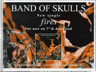
Advertisements & Conventions That Influenced Me:


No comments:
Post a Comment