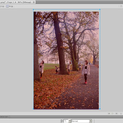
I decided to use the same image as the front cover of my Digipak because i felt it was a extremely good image in terms of artistic presence and also the presentation of the artist.
As the advertisement needed to be big and catch the eye, I didn't crop it and used the full image, because I also wanted to utilize the space for information.
I had decided to use the same font through out all my ancillary work because i felt it would look better then 2 or 3 fonts. The colour of black was used to ensure that the artists name would be visible even from afar.
I didn't want to cover the picture much and so decided to use the portion of the picture at the bottom where the artist does not feature, that is where i would put all the necessary information.
Now it was time to add the relative information and here I had to use conventions of Magazine adverts along other information. I added the date of the album release and to support this i added a pre order title along with logos of the various online outlets the album could be purchased. Social media information was also added for example the artists Facebook, Twitter & her Website. I choose to use white as the font colour because it contrasts well agains the gradient Red and Black, it needs to be clearly visible and readable and i believe i have achieved that.
I created a review and put it on top of a image of the album cover. I felt that this was a convention that couldn't be missed and felt the need to include it as it also adds a professional look and feel.


No comments:
Post a Comment