 |
| I've decided to make the colour black instead of black and white. I think it just looks better. |
 |
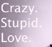
| This is just the name of the album m, i didn't put it straight across because this is the advert and it should be some what different from the actual album cover. |
 |
| The artists name with the Purple background |
 |
| I added a purple boarder because i didn't just want a plain White background i wanted the Purple and White theme to stick throughout the advert and i think it goes well. |


No comments:
Post a Comment