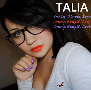
Here are four different ideas that I had for my digipak front cover. I wanted to try placing the artist name and album name in different places to see how it will look. The second to last image I wanted to move away from the pink writing and focus on the colour of the writing blending with Talia’s nails and lips. So I tried out different colours and in the third image these were the three that matched the most accurately. I'm now thinking of changing my colour scheme which was originally black and pink to white and one of the three colours above. I was also thinking of using all three colours for the album name so it would look like the last picture.


No comments:
Post a Comment